Dark & Light Mode
Outsprint supports both dark and light themes. Dark mode is the default experience, designed for comfortable extended use.
Switching Themes
Click the theme toggle in the top bar to switch between dark and light mode. Your preference is saved automatically and persists across sessions.
Dark Mode
Dark mode is the default theme. It uses a deep black background with light text, designed for low-light environments and extended screen time.
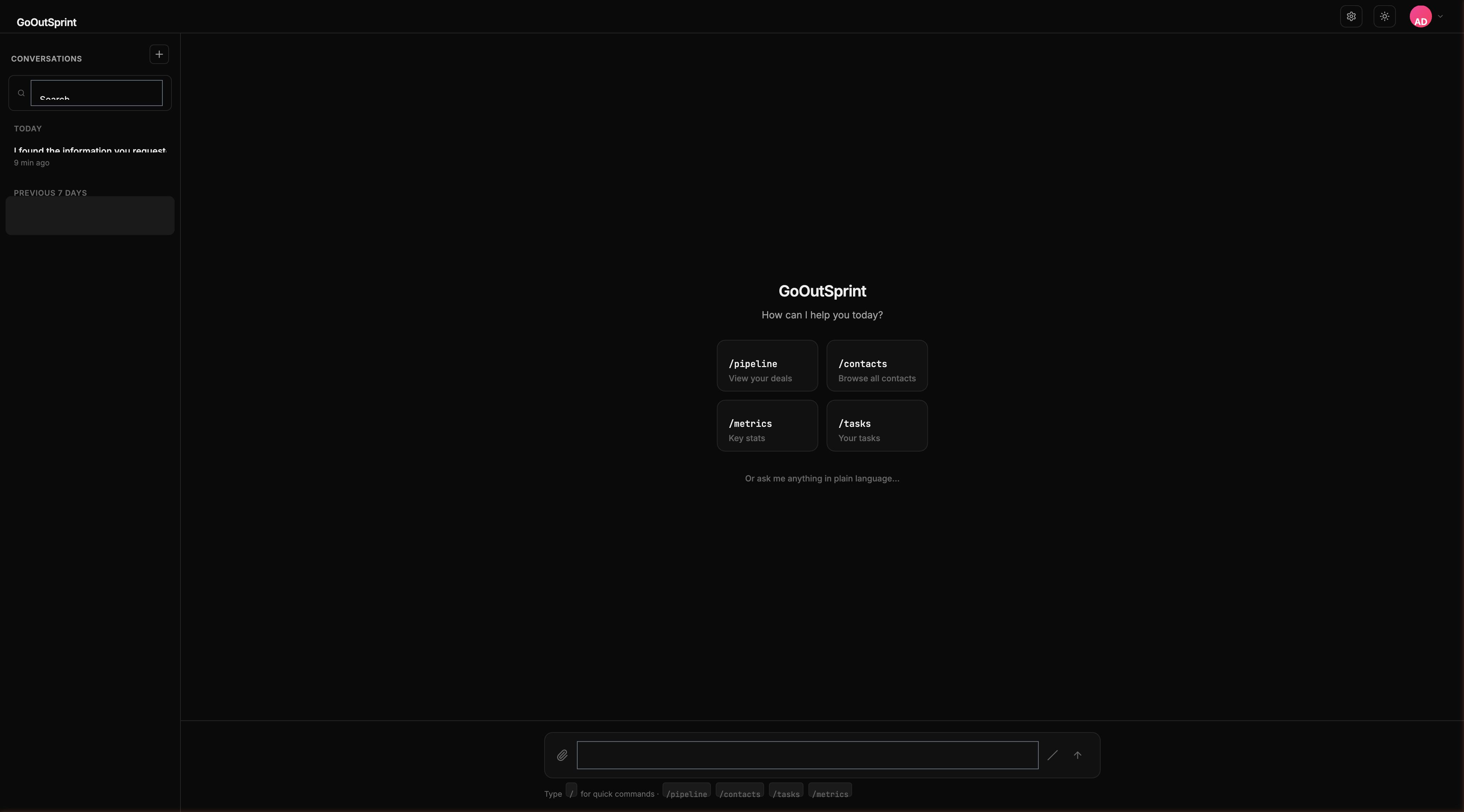
- Page background: near-black
- Cards and render blocks: slightly elevated dark surface
- Text: light grey for readability
- Borders: subtle dark dividers
Light Mode
Light mode uses a white background with dark text, suitable for well-lit environments.
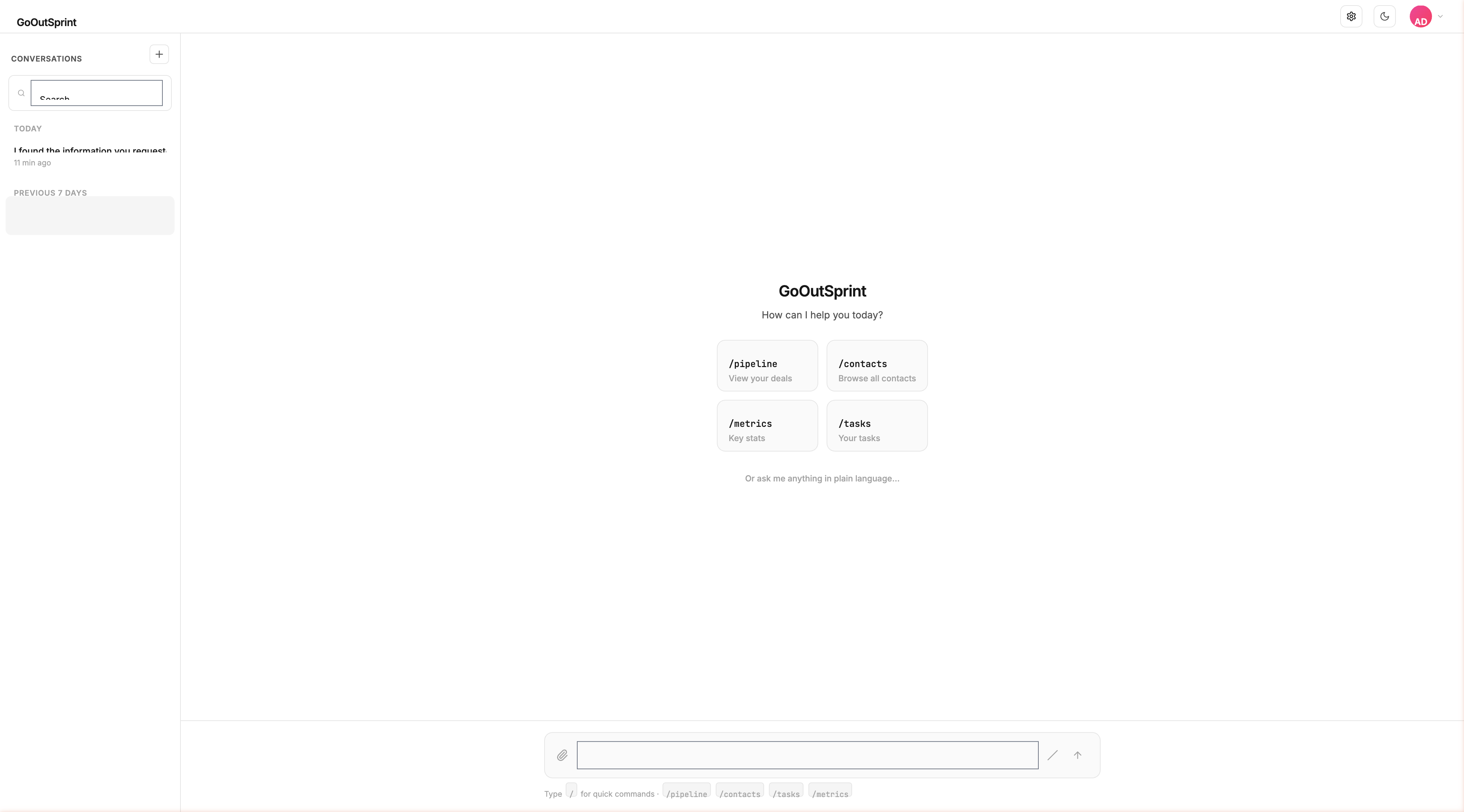
- Page background: white
- Cards and render blocks: light grey surface
- Text: near-black for contrast
- Borders: light grey dividers
Consistent Experience
All render blocks, charts, forms, and UI elements adapt automatically to the selected theme. Semantic colors for statuses (green for success, red for errors, yellow for warnings) remain consistent across both modes.
Note
Your theme preference is stored locally in your browser. If you use Outsprint on multiple devices, you may need to set your preference on each one.